Avoid These Mistakes with Safety and Warning Signs: Top 16 Expert Tips
Understanding the Purpose of Safety and Warning Signs
Communicating Risk Effectively
Safety and warning signs are not decorative—they are critical tools for hazard communication. Their primary function is to inform people of potential dangers, direct appropriate behavior, and ensure compliance with safety regulations.
Saving Lives through Simplicity
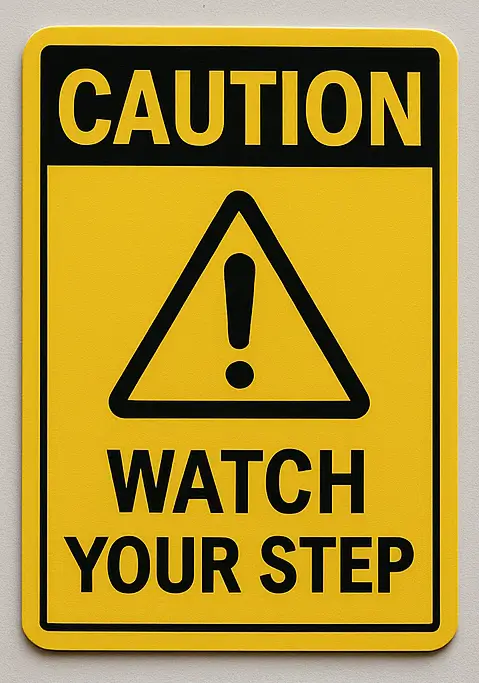
The simplicity of a clear “High Voltage” or “Wet Floor” sign can mean the difference between safety and injury. When designed and placed correctly, these signs guide decisions and prevent confusion during emergencies.

Most Common Mistakes Businesses Make
Poor Visibility and Placement
A sign placed too high, too low, or behind an obstruction can be rendered useless. Visibility is key—signs should be at eye level and unobstructed.
Ignoring Sign Updates
Regulations change, and hazards evolve. Relying on outdated signs that no longer reflect current conditions or standards is a major liability.
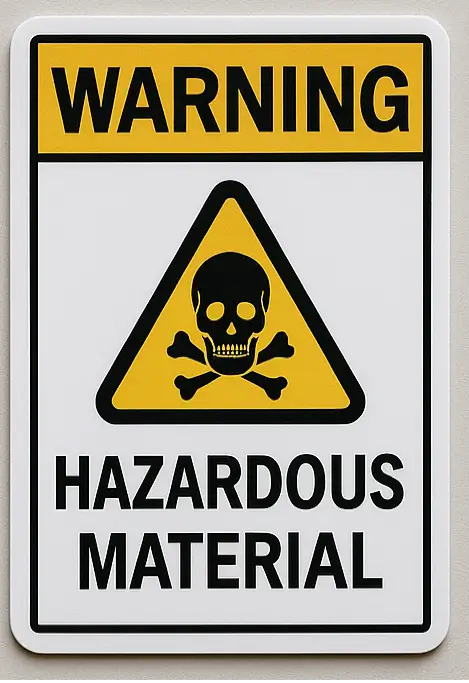
Wrong Color Codes
Using the wrong colors—like a red background for an informational sign—can confuse or mislead. Follow international color coding for clarity and compliance.
Legal Pitfalls to Avoid
Non-Compliance with OSHA and ANSI
Failing to meet OSHA and ANSI standards can result in citations, fines, or worse, accidents. These regulations define everything from sign placement to font size.
Lawsuits from Inadequate Signage
If someone is injured in an area lacking proper warning signs, your business could be held legally responsible. Clear signage is not just ethical—it’s legal armor.
Psychological Principles Behind Effective Signs
Color Psychology
Red elicits urgency, yellow grabs attention, and green signals safety. These psychological effects help people instinctively understand a sign’s message.
Symbol Recognition vs. Text-Based Signs
Symbols transcend language barriers and offer faster recognition in critical moments. Combining symbols with brief, clear text maximizes understanding.
Designing Signs That Actually Work
Font Size and Readability
Use bold, sans-serif fonts at a minimum of 1 inch tall per 10 feet of viewing distance. Avoid script or decorative typefaces.
Contrast and Layout
High-contrast designs (e.g., black text on a yellow background) increase visibility. Layout should be uncluttered, with ample spacing between elements.
Multilingual Options
In multicultural environments, multilingual signage ensures that everyone understands the message, reducing risk and liability.

Digital Signage—Pros and Cons
Where Electronic Signs Excel
LED signs can update automatically, show real-time hazard data, and stay visible in low-light or smoky environments.
When Traditional Still Wins
In remote areas or during power outages, traditional signs are still essential. A mix of both offers optimal coverage.
Sign Placement Strategies
Eye-Level Rule
Signs should be placed between 5 and 6 feet from the ground for optimal visibility in standing adults.
High-Traffic Zones
Install signs at entrances, exits, stairways, and other high-traffic areas to ensure maximum exposure.
Sequential Signage for Long Routes
In large facilities, signs should be placed at intervals to reinforce directions and hazards along the route.
Case Studies of Sign Failures
Industrial Accidents Due to Faded Signs
A faded “No Entry” sign at a warehouse led to an unauthorized access incident causing a major injury. Regular maintenance could have prevented it.
Public Incidents from Confusing Icons
A poorly designed swimming pool sign caused a child to enter the deep end, mistaking it for the shallow area. Clearer symbols would’ve avoided the confusion.
Maintenance is More Than Just Cleaning
Inspections
Monthly visual checks help identify faded text, damage, or vandalism that could compromise sign clarity.
Material Lifespan
Signs made of vinyl may only last 3–5 years outdoors, while aluminum options can last a decade or more.
When to Replace
Replace signs if they’re faded, outdated, irrelevant, or no longer compliant with updated regulations.
Training Staff to Respect and Enforce Signage
Safety Culture Integration
Make safety signs part of your workplace’s culture, not just décor. Discuss their meanings in team meetings and orientation sessions.
Simulation-Based Learning
Train employees using simulations to help them react to signs in real scenarios—fire drills, evacuation drills, etc.
Innovations in Safety Sign Materials
Glow-in-the-Dark Materials
Photoluminescent signs remain visible in blackouts, ensuring guidance during power failures or smoke-filled evacuations.
Antimicrobial Coatings
Especially useful in healthcare and food industries, these reduce the spread of bacteria on high-touch signage surfaces.
Cultural Sensitivities and Symbol Interpretation
International Standards vs. Local Expectations
A skull symbol might not convey the same urgency in all cultures. Consider cultural context when designing safety graphics for global teams.
Inclusive Iconography
Use symbols that are universally recognized and avoid stereotypes. For example, a simple person figure works better than complex gendered symbols.
Creating Signs for People with Disabilities
Braille Safety Signs
Braille labels make signage accessible to visually impaired individuals in hospitals, schools, and public spaces.
High-Contrast for Low Vision
Use dark symbols on light backgrounds (or vice versa) for better visibility among those with low vision or color blindness.
Eco-Conscious Safety Signage
Recycled Materials
Choose signs made from recycled aluminum or biodegradable plastic to reduce environmental impact.
Energy-Efficient Digital Signs
Low-voltage LED displays consume less power, especially in 24/7 operations like factories or parking garages.
16 Tips for Choosing the Right Safety Signs
Use ANSI/OSHA compliant designs.
Choose the correct color code.
Select weather-resistant materials.
Ensure the font is bold and readable.
Incorporate clear symbols.
Place at eye level.
Use glow-in-the-dark signs where needed.
Translate signs for multilingual environments.
Keep designs uncluttered.
Avoid using jargon.
Use symbols with text for clarity.
Install in high-traffic areas.
Conduct monthly inspections.
Replace outdated signs immediately.
Train employees to understand signs.
Consider accessibility for all users.
FAQs about Safety and Warning Signs
Q1: What is the most common mistake with safety signage?
A1: Poor placement and visibility—signs hidden behind doors or placed too high are often overlooked.
Q2: Can I make my own safety signs?
A2: Yes, but they must comply with OSHA/ANSI standards to be legally valid.
Q3: How long do safety signs last?
A3: Indoor signs may last 5–10 years; outdoor signs degrade faster due to UV and weather exposure.
Q4: What’s the best material for outdoor signs?
A4: Reflective aluminum or UV-treated PVC is best for durability and clarity.
Q5: Are digital safety signs worth it?
A5: Yes, especially for dynamic environments like manufacturing lines or public transport hubs.
Q6: Do safety signs need to be accessible for people with disabilities?
A6: Absolutely—consider Braille, audio cues, or high-contrast designs for inclusivity.
Conclusion
Safety and warning signs are only effective when thoughtfully designed, legally compliant, and clearly understood. Avoiding common mistakes—like poor visibility or outdated icons—can save lives, reduce legal risk, and foster a safer, more inclusive environment. Follow expert tips, maintain your signage regularly, and keep pace with innovations to ensure your spaces stay safe for everyone.